Enterprise Architecture
Project description
Ardoq is an enterprise architecture platform, allowing companies to upload, process and visualize their data. By doing this, Ardoq enables its customers to take data-based decisions. In this project, i worked with the team responsible for data visualizations and dashboards. My tasks consisted both of creating new functionality, as well as updating and improving existing functionality. I worked in close collaboration with enterprise architects, developers and other designers.
The work often consisted of understanding and navigating complex data processes and expert user needs in order to make the software more user friendly. There was also big focus on collaboration between the designers in different product teams, as well as the design system team, in order to ensure consistency in UI and interaction patterns across the software.
Redesign of use cases
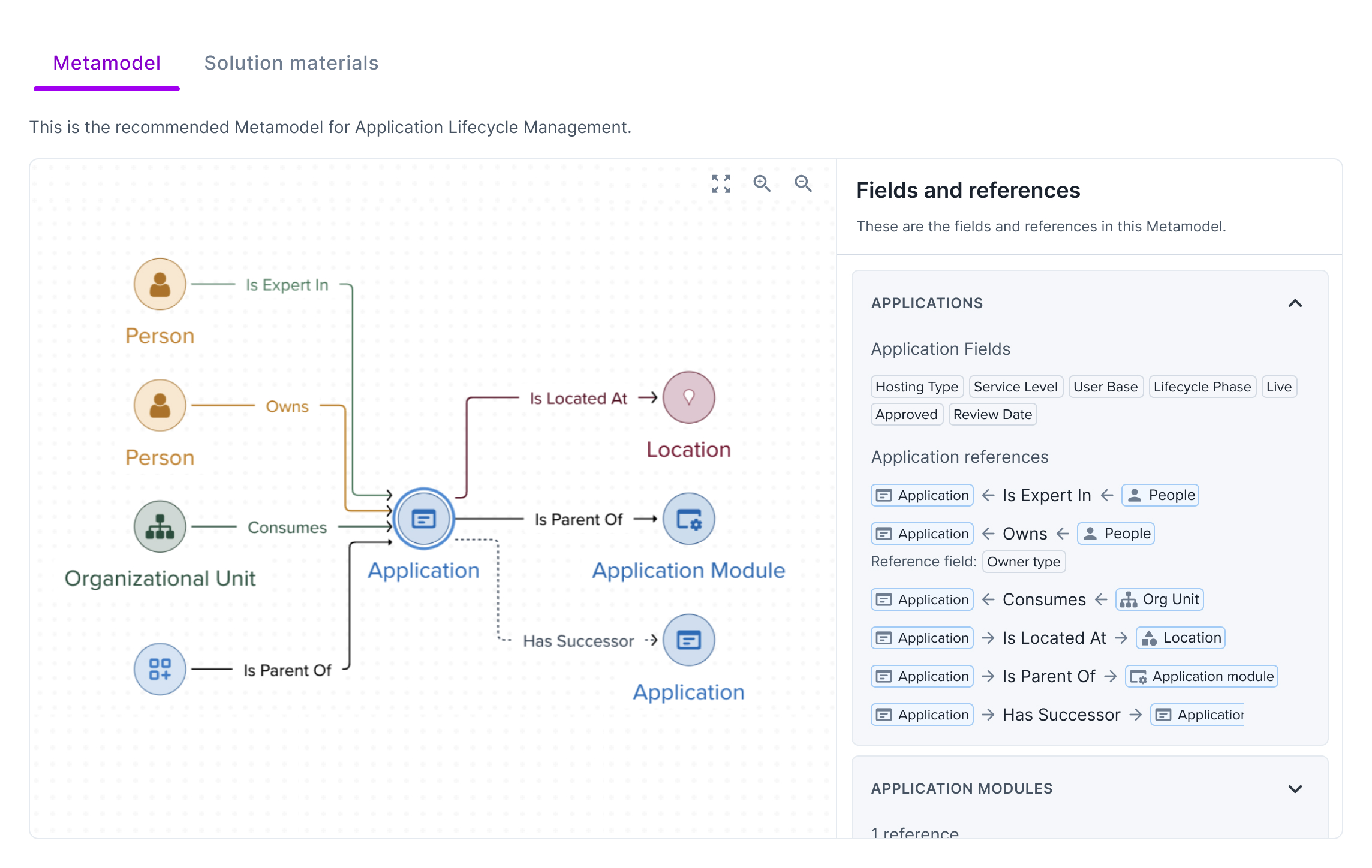
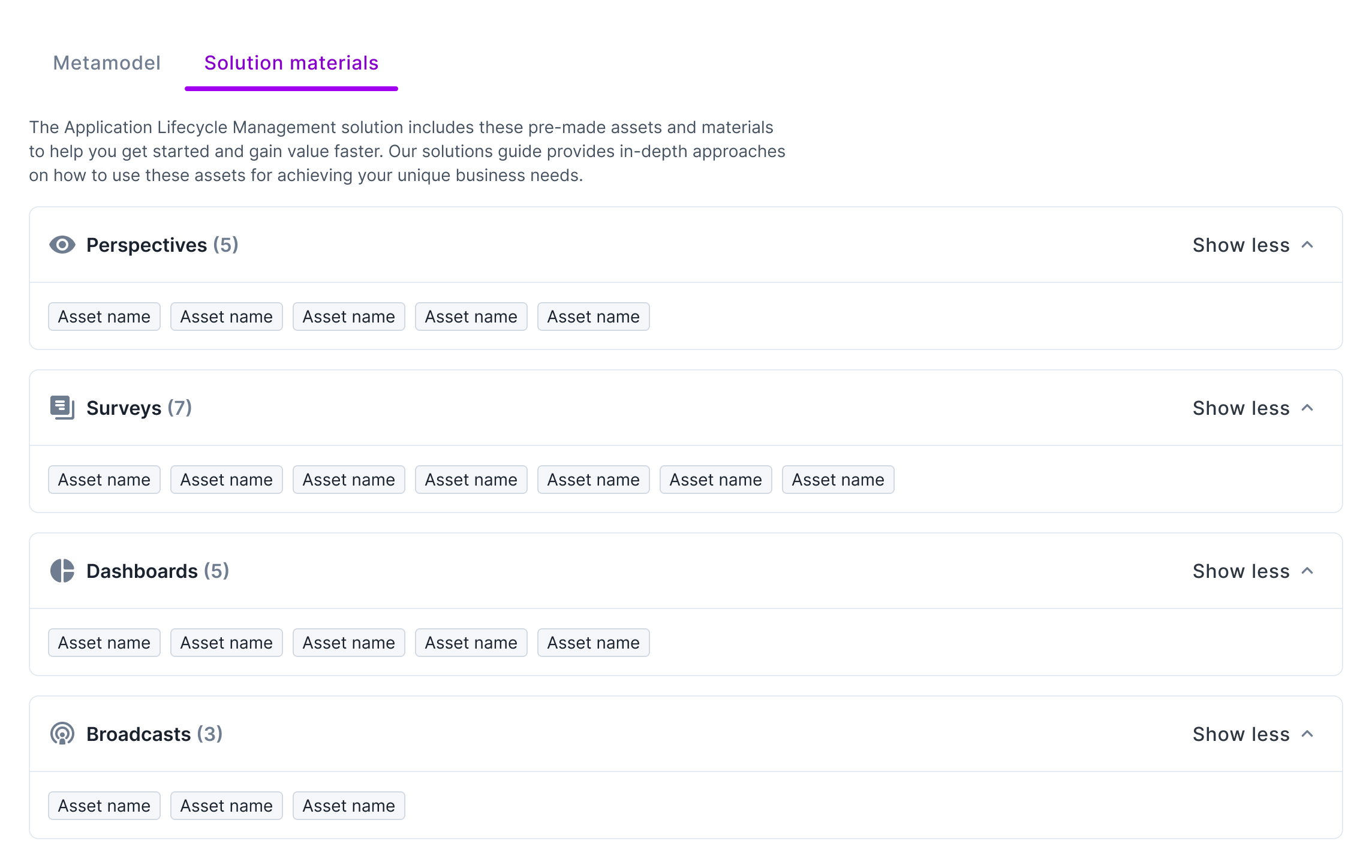
Redesigning pages for use cases to give better understanding of what a specific use case can help the company achieve, as well as which assets are downloaded with the solution, and how they are structured. Before the rework, the use case consisted of a short explanatory text, as well as a long pdf document, making the key information about the use case difficult to find. In the rework, this key information is incorporated and clearly presented in the main page. An example of this type of information is called the use case metamodel - a model of how data should be structured in order to achieve the goals fo the use case.
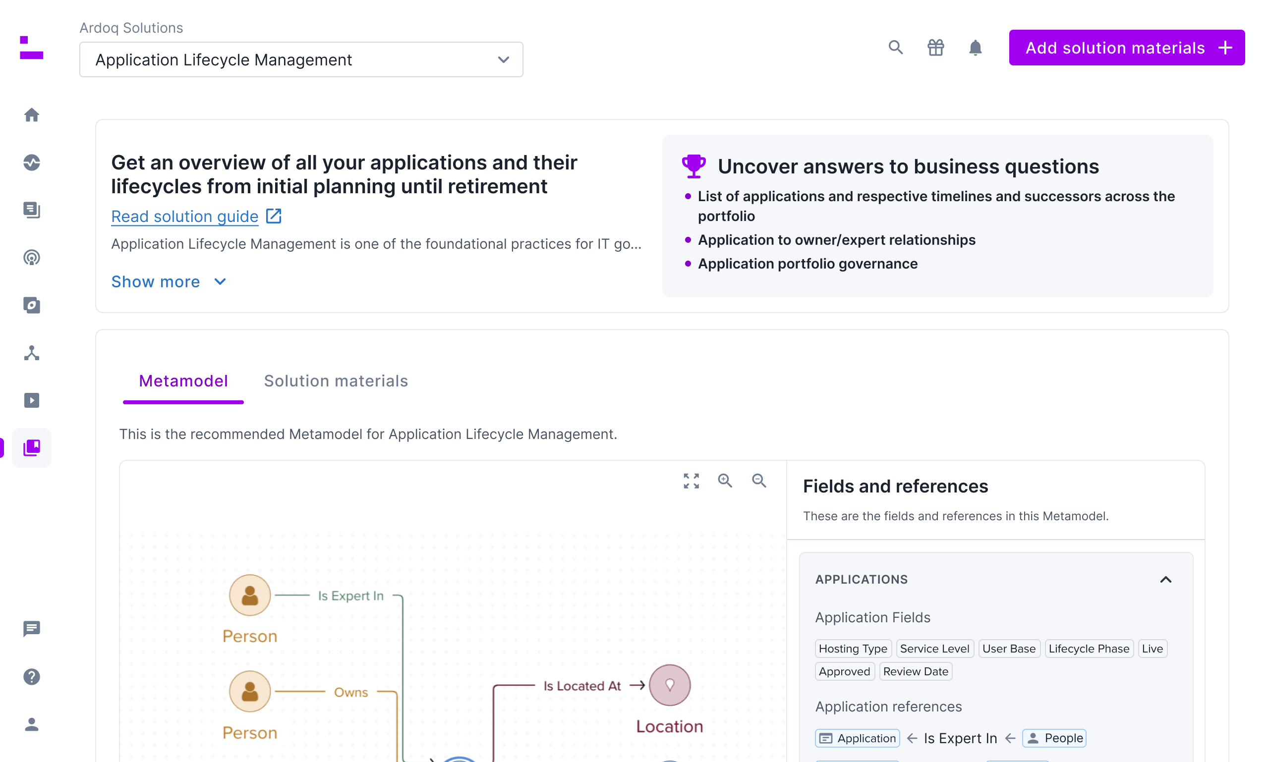
The redesigned use cases includes a visual representation of the metamodel, as well as a detailed list of assets included in the use case.
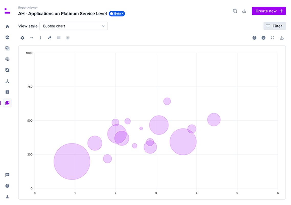
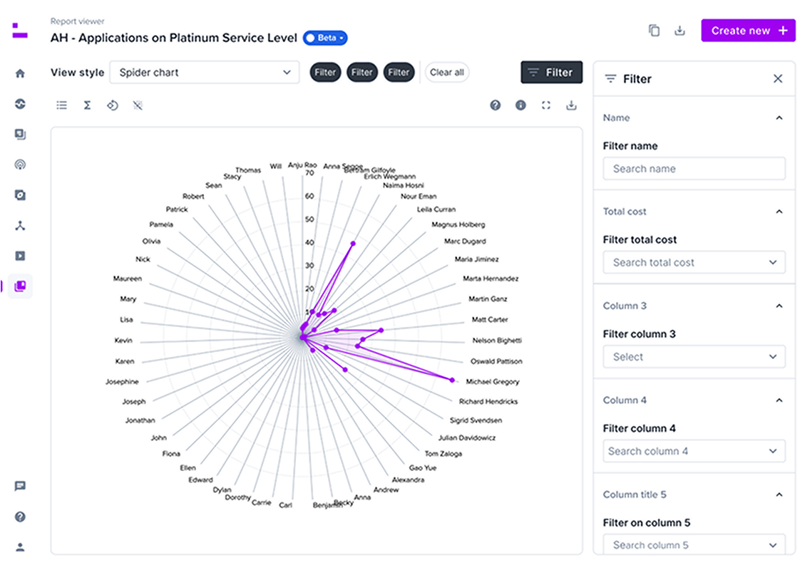
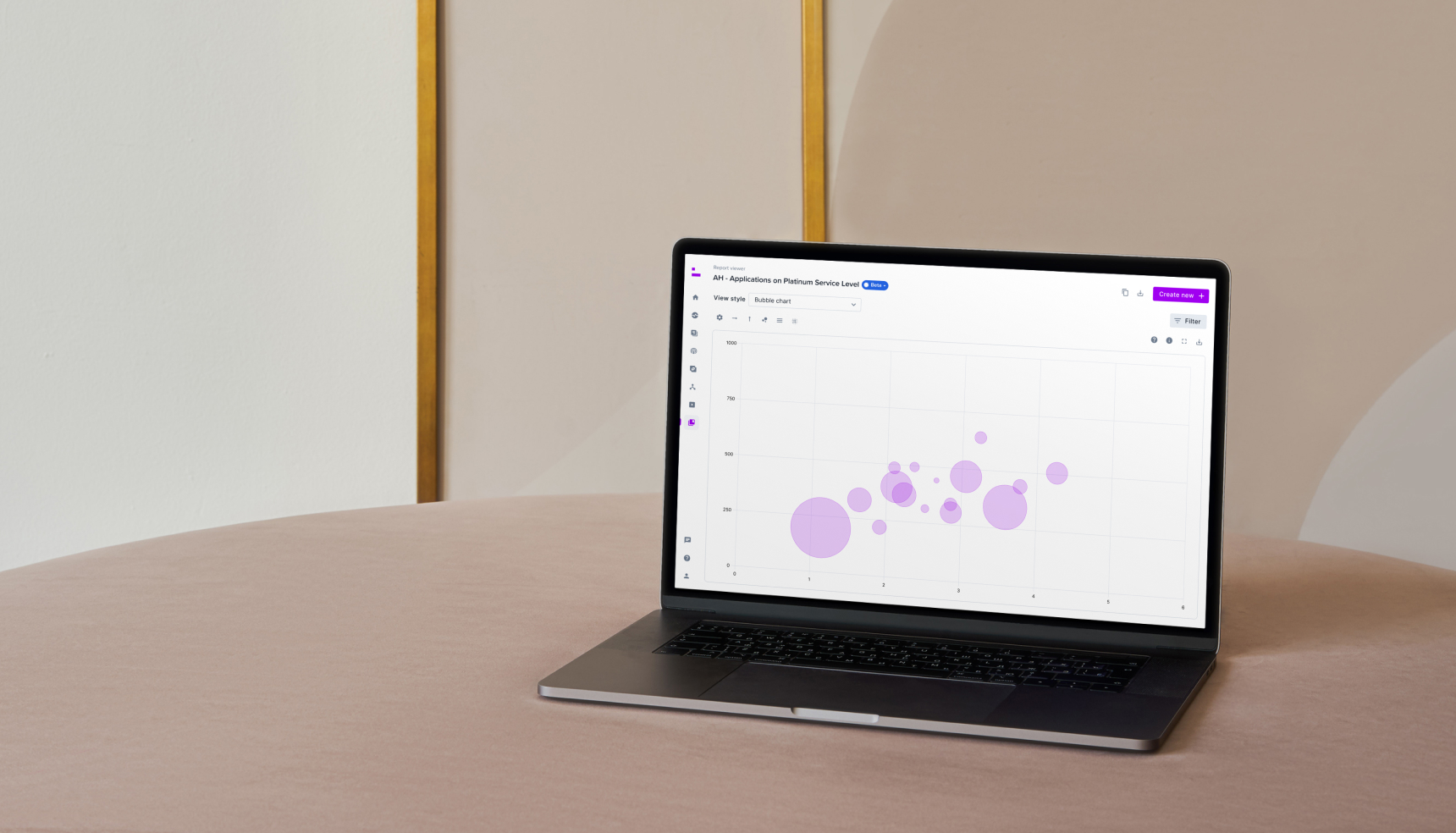
Visualization of tabular data
Adding different visualization methods to tabular datasets. By expanding on the possibilities when it comes to data visualizations, we allow the users to discover key patterns and insight in their data. This task included collaboration with customers, sales and the product manager to explore which visualization methods would add the most value. We landed on bar charts, line charts, bubble charts and radar charts for the first iteration. After, I defined the behavior for the different visualization methods, and functionality for the view overall. This includes how to add filters, defining/changing values of axes, number of columns to include etc.